

Table of Contents
Introduction
Ever wondered why your eyes gravitate toward certain products on shelves? It often comes down to color packaging box—not just its hue, but the emotion, mood, and perception it evokes. In today’s competitive market, intelligent use of color in packaging design can make the difference between a quick glance and a decisive purchase. Let’s dive into how color impacts consumer psychology and how your brand can leverage this power.
Understanding the psychology behind color packaging box
A color packaging box communicates silently yet powerfully. Different colors evoke specific feelings: red signals energy, blue inspires trust, and green connects with nature and sustainability. According to consumer behavior studies, packaging color alone contributes to up to 90% of snap decisions in stores. By tapping into color psychology, your packaging can align with buyer motivations—from excitement to relaxation and premium perception.
Key colors and their consumer associations
Red: urgency and passion
Red triggers excitement and appetite, making it effective for impulse buys or limited-time offers. It’s best suited for dynamic design and bold statements.
Blue: trust and calm
Blue is associated with reliability and professionalism. It’s ideal for health, beauty, and tech categories where credibility matters most.
Green: nature and wellness
Green connotes freshness, organic origins, and wellness. It works well for eco-friendly or health-oriented products.
Yellow/Orange: optimism and warmth
These cheerful colors grab attention and create a feeling of positivity. Bright, appealing and perfect for playful or youth-targeted items.
Black/Gold: luxury and sophistication
Deep, rich tones convey premium quality and exclusivity. Excellent for high-end, gift-worthy packaging.
Choosing the right color packaging box for your audience
Align color choices with your brand message and your audience’s expectations:
- Premium consumers respond well to black, gold or silver accents.
- Children’s products shine with bold primary colors and playful contrasts.
- Health products perform well with white, green, or natural tones that signal purity.
- Modern tech items benefit from minimalist, cool-toned palettes like greys or deep blues.
Balance emotional impact with readability—easy-to-spot branding, clear text, and complementary color combinations.
Materials, finishes, and printing techniques that enhance color impact
A color packaging box is more than just ink—materials and finishes play a big role:
- Matte laminated stock softens colors for a refined appeal
- Glossy coatings intensify brightness and make packaging pop under light
- Spot UV and metallic foils accentuate logos and decorative elements
- Embossing or debossing adds a tactile dimension that feels premium
- Eco-friendly paper with natural texture supports organic or earth-conscious messaging
These choices enhance color perception, elevate shelf presence, and align with evolving consumer values.
Cost vs impact: Balancing design choices
| Design Element | Consumer Impact | Typical Cost Effect |
|---|---|---|
| Full-color printing | High visual appeal | Moderate |
| Specialty inks (metallic) | Premium feel | Higher |
| Soft-touch matte finish | Tactile appeal and elegance | Moderate to high |
| Spot UV accents | Focuses attention on key areas | Moderate |
| Sustainable materials | Eco-friendly positioning | Can be cost-neutral with scale |
Choosing impactful yet cost-effective combinations helps boost brand perception without overshooting budgets.
Real-world success stories with color packaging boxes


Brands in food, beauty, and wellness have leveraged color effectively:
- A snack line used bright orange packs to boost impulse purchases in checkout aisles
- A wellness supplement brand switched to green kraft boxes for a cleaner, healthier image
- A high-end accessory company added black matte boxes with spot UV logo for premium unboxing
These designs showed measurable increases in shelf visibility and perceived quality in multiple campaigns.
Color consistency across offline and digital channels
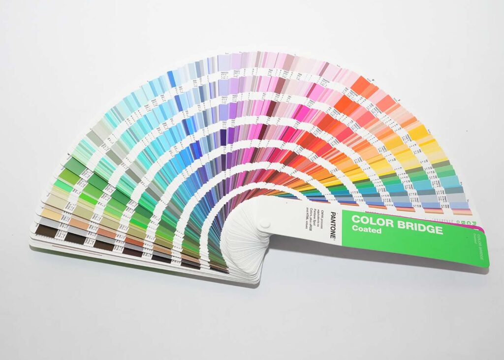
Today’s customers experience packaging both on screen and in-hand. Use color calibration tools, brand color guidelines with Pantone codes or color profiles, and materials samples to ensure consistency across printed packaging, digital mockups, and product photos.
Conclusion
Choosing the right color for your packaging box is a strategic decision—not just aesthetic. When paired with thoughtful material and finish choices, it shapes brand identity, confirms quality, and drives consumer perception. It’s the first handshake between product and buyer; make it count.
Ready to elevate your brand with color packaging box designs that speak volumes? Contact Zhenghua today—we specialize in custom designs, paper stock selection, printing finesse, and full production service to bring your vision to life.
FAQ
Can changing box color really influence sales?
Yes—studies show packaging color alone influences as much as 70–80% of purchase decisions, depending on the category.
Is it worth investing in premium finishes?
Yes—for brands positioning as premium, finishes like spot UV and matte coatings can boost perceived value by over 20%.
How do we choose complementary and accessible colors?
Use contrast analysis, gender-neutral palettes, and test designs through mockups and focus groups.
Are certain colors off-limits due to legal restrictions?
Generally not, but avoid confusion with regulated products like pharmaceuticals. Neutral, clear branding is safest.
Can packaging color support sustainability claims?
Absolutely—natural tones, recycled stock, and eco-conscious finishes tell the right story without excessive ink or foil.
